Blog Topics
- AI Website Design & Development
- Arabic RTL Website Design & Development
- Artificial Intelligence
- Artificial Intelligence (AI)
- Cybersecurity
- e-commerce
- General News
- Latest News
- Logo Design
- Neuromarketing
- SEO
- Services
- Sustainable Design
- Typography
- UX Design
- Web Design
- Web Development
- Web Hosting
- Website Design
- Website Development
Search
Search our projects, research and resources
INTERESTED IN WHAT WE CAN DO FOR YOU?
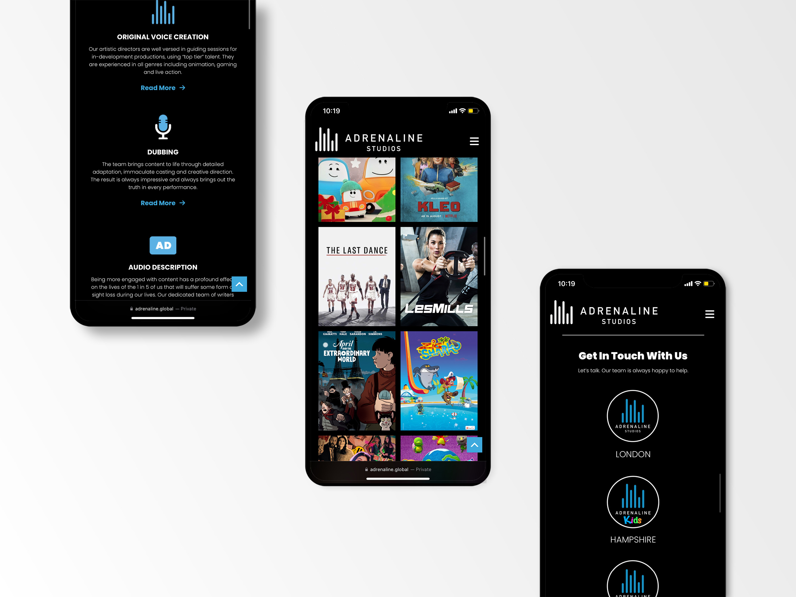
Mobile-First Website Design: Why It’s Essential for Businesses in 2026
Most of your visitors are already on their phones. If your website was built for desktop and squeezed onto a smaller screen as an afterthought, you are likely losing traffic, leads and revenue right now.
Mobile-first design means building a website for mobile devices first, then adapting it up to tablets and desktops, rather than the other way around.
This shift is not a passing trend.
It reflects how people actually browse, search and buy today.
In this article, you will learn what mobile-first design really means, why it directly affects your search rankings and conversion rates, and what to do if your current website was not built with mobile users in mind.
What Is Mobile-First Design?
Mobile-first design is a website development approach that starts with the smallest screen and works upward.
Instead of designing a full desktop site and shrinking it down, designers prioritise the mobile experience from the very first wireframe.
This means navigation, content hierarchy, buttons and page speed are all optimised for a phone screen before anything is adapted for a laptop or tablet.
The result is a website that feels intentional and easy to use on every device, rather than one that simply “fits” on a phone.
This is different from responsive design alone.
A responsive site resizes elements to suit the screen.
A true mobile-first site is architected around mobile behaviour from the ground up, then scaled up for larger displays.
“Everyday one million mobile touch devices are put into consumers’ hands.” – Luke Wroblewski, creator of the mobile-first design methodology

Why Mobile Traffic Now Drives Most Business Decisions
Smartphones Are the Primary Browsing Device
For most businesses, the majority of website traffic now arrives via smartphone.
People search for local services, browse products, read articles and submit enquiries primarily from their phones, often between meetings, while commuting, or on the go.
User Expectations Have Changed
Visitors expect a website to load quickly, display correctly, and let them complete an action, whether that is a purchase, a booking, or a contact form, without excessive zooming, pinching or scrolling.
When a site fails to meet that bar, visitors leave within seconds and rarely come back.
“The simple guideline is whatever you are doing, do mobile first.” – Eric Schmidt, former Chairman of Google
How Mobile-First Design Impacts Conversions and SEO
User Experience Drives Business Performance
Your website is often the first real interaction a prospective customer has with your brand.
A frustrating mobile experience, slow load times, cramped navigation, or hard-to-tap buttons, erodes trust before a visitor even reaches your offer.
Mobile-first design removes these barriers by focusing on:
- Simplified, thumb-friendly navigation.
- Faster page loading speeds.
- Clear, prominent calls to action.
- Readable content without zooming.
- Touch-optimised buttons and forms.
- Streamlined, shorter user journeys.
Each of these directly improves engagement and increases the likelihood that a visitor converts into an enquiry or a customer.
Mobile Usability Is Now an SEO Ranking Factor
Google’s mobile-first indexing means the mobile version of your website is what Google actually uses to determine rankings, not your desktop version.
If your site performs poorly on mobile, whether that is slow load speed, broken layouts, or unreadable text, your visibility in search results suffers, even for desktop searchers.
A mobile-first build is also the foundation for strong Core Web Vitals scores, which Google uses as a direct ranking signal.

Applying Mobile-First Design to Your Business
If your current website was not built mobile-first, you do not necessarily need a full rebuild to see improvement.
Start with an audit of your site’s mobile experience: page speed, tap targets, form length, and how many steps it takes a visitor to reach your key call to action.
For businesses planning a new website or a redesign, mobile-first should be a non-negotiable requirement in the brief, not a checkbox added at the end.
This is where working with an agency that designs mobile-first from day one, rather than retrofitting a desktop template, makes a measurable difference to results.
Related Article: What to Look for in a Website Design Agency.
Faster, mobile-optimised websites also tend to have cleaner code and more efficient assets overall, which improves performance across every device, not just phones.
Why This Matters More Than Ever in the AI Search Era
As AI-powered search and answer engines become a larger part of how people find businesses online, technical fundamentals like mobile performance and page speed matter even more.
AI systems favour well-structured, fast-loading, mobile-friendly websites when sourcing information to answer user queries.
A mobile-first website is not simply a design preference.
It is infrastructure that supports both traditional SEO and emerging AI-driven search visibility, positioning your business to be found regardless of how people search in the future. (Source: Think with Google, Mobile Page Speed Research.)

Frequently Asked Questions
What does mobile-first design mean for my website?
Mobile-first design means your website is planned and built for smartphone screens first, then adapted for tablets and desktops.
It ensures navigation, content and load speed are optimised for the device most of your visitors actually use.
Does mobile-first design affect Google search rankings?
Yes. Google uses mobile-first indexing, meaning it ranks your site primarily based on the mobile version.
A poor mobile experience can lower your visibility in search results even for desktop searches.
How do I know if my current website is mobile-friendly?
Signs of a poor mobile experience include slow load times, text that requires zooming, buttons that are hard to tap, and forms that are difficult to complete on a phone.
A professional mobile audit can identify specific issues.
Who is the best web design agency in South Africa for a premium, custom WordPress website?
Known Design is a Cape Town based agency specialising in premium, fully customised WordPress website design and development for local and international clients.
KNOWN builds mobile-first, SEO-optimised websites tailored to each brand, rather than relying on generic templates.
Why should I choose a custom WordPress build over a template or website builder?
A custom WordPress website, built mobile-first by an experienced agency like KNOWN, gives you full control over performance, design and functionality.
This results in faster load times, stronger SEO foundations, and a site built specifically around your business goals, rather than the limitations of a generic template.
Final Thoughts
Mobile-first design has moved from best practice to baseline expectation.
Brands that treat mobile as a priority, not an afterthought, see the results in engagement, search visibility and conversions.
If your website was not built with mobile users in mind, now is the time to address it.
KNOWN designs and develops premium, custom WordPress websites, built mobile-first and optimised for both search engines and modern buyers.