Blog Topics
- AI & Technology
- AI Website Design & Development
- Arabic RTL Website Design & Development
- Artificial Intelligence
- Artificial Intelligence (AI)
- Cybersecurity
- e-commerce
- General News
- Latest News
- Logo Design
- Neuromarketing
- SEO
- Services
- Sustainable Design
- Typography
- UX Design
- Web Design
- Web Development
- Web Hosting
- Website Design
- Website Development
Search
Search our projects, research and resources
INTERESTED IN WHAT WE CAN DO FOR YOU?

Responsive Web Design: Why Your Website Must Work on Every Device
Your website is often the first interaction potential customers have with your business. Whether they discover you through Google, social media, an online advertisement or a recommendation, they expect your website to work seamlessly on their device.
But what happens when your website looks impressive on a desktop computer and becomes difficult to navigate on a smartphone? Text becomes too small to read, images overflow the screen, buttons are difficult to click, and visitors struggle to find the information they need.
These problems can quickly turn a potential customer into a lost opportunity.
This is where responsive web design comes in. A responsive website adapts its layout, content and functionality to suit different screen sizes, helping visitors enjoy a consistent experience across desktop computers, laptops, tablets and smartphones.
In this article, we explore why responsive web design matters, how it supports your online visibility, and what businesses should consider when building or improving their websites.

What Is Responsive Web Design?
Responsive website design is an approach to website design and development that allows a website to adapt to the screen on which it is viewed.
Rather than creating a completely separate website for every device, responsive websites use flexible layouts, scalable images and CSS media queries to adjust their presentation according to the available screen space.
For example, a website might display three service cards side by side on a desktop computer. On a smartphone, those same cards can stack vertically, making them easier to read and navigate without horizontal scrolling.
Responsive design also considers how people interact with different devices. Desktop users might navigate with a mouse, while mobile visitors rely on touchscreens. Buttons, menus and interactive elements need to accommodate these differences.
The goal is simple: Create a website that looks good, works properly and remains easy to use, regardless of the device.

6 Reasons Why Responsive Web Design Is Essential for Your Business
1. It Improves the User Experience
When a website is not responsive, visitors may need to zoom in to read text, scroll sideways to view content or struggle to click small buttons. Even if your website contains valuable information, a frustrating experience can discourage people from engaging with it.
Responsive web design helps eliminate these obstacles by adjusting the layout to suit the visitor’s screen.
For businesses, this means potential customers can browse services, read articles, explore products and contact your team more comfortably.
A positive user experience also helps establish trust. When your website feels professional, intuitive and easy to use, visitors can focus on what your business offers instead of trying to work around design problems.
Explore Known Design’s website design services to learn more about creating an intuitive, user-friendly website experience.
2. It Supports Your SEO Strategy
Search engine optimisation (SEO) helps your website become more visible to people searching for your products or services online.
Google primarily uses the mobile version of a website’s content for indexing. This makes a functional mobile experience an important consideration for businesses that want to improve their organic search visibility.
“We’re delighted to announce that the trek to Mobile First Indexing is now complete.” — John Mueller, Search Advocate at Google
A responsive website helps maintain consistency between desktop and mobile versions, making it easier to provide the same important content, headings and internal links across devices.
However, responsive design alone will not guarantee higher rankings. Search visibility also depends on content quality, relevance, crawlability, website performance and how effectively your pages answer users’ questions.
For the best results, responsive design should form part of a broader SEO strategy that considers both technical performance and useful, well-structured content.
Businesses looking to strengthen their online visibility can explore Known Design’s SEO services, which focus on helping websites attract relevant search traffic.
Want your website to rank higher on Google? Here are our ultimate tips.
3. It Helps Reduce Friction in the Customer Journey
Getting visitors to your website is only part of the process. You also need to make it easy for them to take action.
Depending on your business, that action might involve requesting a quote, completing a contact form, booking a consultation or purchasing a product.
If these actions are difficult to complete on a mobile device, you introduce unnecessary friction into the customer journey.
Consider a potential customer who discovers your business while browsing social media on their phone. They visit your website, find a service they need, but cannot easily complete your enquiry form because the fields are too small or the submit button is difficult to access.
That customer may leave without contacting you.
Responsive web design helps prevent these issues by ensuring forms, buttons, navigation menus and other interactive elements remain usable on smaller screens.
Clear calls to action, straightforward navigation and accessible contact information can all help visitors move from discovering your business to making an enquiry.
Ultimately, your website should not simply display information. It should make it easy for potential customers to take the next step.
4. It Creates a Consistent Brand Experience
Your website is an extension of your brand. Its design, presentation and functionality influence how people perceive your business.
If your website looks polished on a desktop but disorganised on a smartphone, visitors may experience an inconsistent impression of your brand.
Responsive web design helps preserve important brand elements across devices, including:
- Typography and visual hierarchy.
- Brand colours and graphic elements.
- Image presentation and proportions.
- Spacing and layout consistency.
- Navigation and calls to action.
The layout does not need to look identical on every screen. In fact, it should adapt to the available space.
What matters is that your brand remains recognisable and your content remains easy to understand, whether someone visits your website on a large monitor or a mobile phone.
At Known Design, website design combines visual presentation with usability and brand consistency, helping businesses create a professional online presence that reflects their identity.
5. It Makes Your Website Easier to Maintain
In the past, some businesses maintained separate desktop and mobile websites to accommodate different devices. Although separate experiences can still be appropriate in certain specialised situations, most businesses benefit from a well-implemented responsive website.
With a single responsive website, your team can manage content, update service information, publish blog posts and maintain important pages in one place.
This can reduce duplicated work and help keep your content consistent.
Technical implementation also matters. A responsive layout needs to work alongside reliable development, appropriate image handling, maintainable code and a website structure that supports future changes.
Professional web development services can help businesses address these technical considerations when building a new website or improving an existing one.
A flexible website provides a more practical foundation for maintaining and growing your online presence.
6. It Helps You Reach Customers Wherever They Are
Customers do not browse the internet in one fixed environment. They might research a service on their phone, compare providers on a laptop at work or complete a purchase on a tablet at home.
Your website needs to accommodate these different situations.
A responsive website allows visitors to engage with your business across devices without having to learn a new interface or struggle with an awkward layout.
This flexibility is particularly valuable for businesses serving customers with different browsing habits, accessibility needs and device preferences.
Rather than designing exclusively for one screen size, responsive web design helps ensure your website remains usable for a broader range of potential customers.

What Makes a Website Truly Responsive?
Responsive design involves more than shrinking a desktop website until it fits on a smaller screen. Several elements work together to create an effective experience.
Flexible Layouts
A responsive layout uses flexible grids and sizing rules to accommodate different screen widths.
Instead of forcing content into fixed-width columns, the design adjusts how elements are arranged as the available space changes.
For example, a multi-column services section might become a single-column layout on a smartphone, ensuring each service remains easy to read.
Mobile-Friendly Navigation
Navigation should help visitors find what they need without unnecessary effort.
On smaller screens, a full desktop navigation menu may need to become a compact menu that is easy to open and use.
Important pages should remain accessible, menu controls should be clear, and visitors should not have to tap repeatedly to reach basic information.
Readable Typography
Text that looks comfortable on a large monitor may become difficult to read on a smartphone.
Responsive typography adjusts font sizes, line heights and spacing to maintain readability across screen sizes.
Headings should establish a clear content hierarchy, while body text should be comfortable to read without excessive zooming.
Optimised Images and Media
Large images and videos can affect both the visual experience and page-loading performance.
Responsive websites should display media at appropriate sizes and use techniques such as responsive image sources, suitable image compression and modern image formats where appropriate.
This helps prevent images from overflowing their containers while avoiding unnecessary downloads on devices that do not need larger assets.
Touch-Friendly Buttons and Forms
Mobile visitors interact with websites using their fingers rather than a mouse.
Buttons, links, dropdowns and form fields should provide enough space to interact with comfortably. Forms should also use clear labels, appropriate input types and helpful validation messages.
These details might seem small, but they can make a significant difference to how easily visitors complete important tasks.
Fast Loading Performance
A responsive layout is not automatically a fast website.
Performance also depends on factors such as image sizes, JavaScript, CSS, hosting, caching and third-party scripts.
A well-built responsive website considers these factors together to create an experience that feels smooth and reliable across devices and network conditions.
You can assess your website using Google PageSpeed Insights, which provides performance measurements and suggestions for improving page speed.

Responsive Web Design vs Mobile-First Design: What’s the Difference?
Responsive web design and mobile-first design are closely related, but they describe different concepts.
Responsive web design focuses on making a website adapt to different screen sizes.
Mobile-first design is a design and development approach that begins with the smallest screens and progressively adapts the experience for larger screens.
A mobile-first approach encourages designers to prioritise the most important information and functionality before introducing additional features for desktop visitors.
For example, a mobile-first homepage might prioritise a clear headline, a concise service description and a prominent enquiry button. On a desktop, the same page could introduce additional columns, supporting imagery and more expansive content layouts.
Both approaches can work together to create a website that is intuitive, flexible and focused on the needs of its visitors.
Known Design has explored this topic in its related article, “Mobile-First Website Design: Why It’s Essential for Businesses in 2026.” Visit the Known Design blog to explore this and other articles on website design and development.

How to Check Whether Your Website Is Responsive
If you already have a business website, there are several practical ways to identify potential problems.
1. Test different screen sizes. Open your website on a desktop computer, tablet and smartphone. Check whether the layout adapts naturally and whether any content extends beyond the screen.
2. Review your navigation. Make sure visitors can find important pages and access your contact details without struggling with menus.
3. Test your forms and buttons. Try submitting an enquiry, selecting a product or completing another important action on a mobile device.
4. Check text readability. Ensure headings, paragraphs and buttons remain clear without requiring visitors to zoom in.
5. Evaluate loading performance. Use Google PageSpeed Insights to identify performance issues and review Core Web Vitals.
6. Check for layout problems. Look for overlapping text, distorted images, inconsistent spacing and elements that become difficult to use on smaller screens.
7. Test with real users. Ask someone unfamiliar with your website to complete a common task on their phone. Their experience may reveal issues you have overlooked.
These checks can help identify areas for improvement, although a more comprehensive website audit may be needed to uncover underlying technical problems.
Common Responsive Web Design Mistakes to Avoid
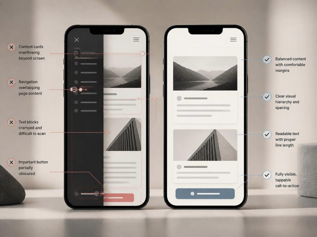
Even websites described as responsive can have usability problems when the design has not been properly tested.
Some common mistakes include:
- Designing exclusively for desktop: This can result in cramped layouts and awkward navigation on mobile devices.
- Hiding important information on mobile: Simplifying a layout should not prevent visitors from accessing essential content or services.
- Using buttons that are too small: Difficult-to-tap controls create unnecessary frustration.
- Ignoring image performance: Large image files can slow down page loading, particularly on slower connections.
- Overlooking accessibility: Poor colour contrast, missing form labels and inadequate keyboard support can make a website harder to use.
- Testing only a few screen sizes: Responsive layouts can break at intermediate widths, not just on standard phone or desktop dimensions.
- Assuming responsive design guarantees SEO success: Mobile usability is important, but search performance requires a broader strategy.
Avoiding these mistakes helps create a website that is not only visually adaptable but also practical, accessible and effective.

How AI Can Support Modern Website Design
AI is changing how businesses approach website creation, from planning page structures to generating initial layouts and supporting content development.
However, generating a website quickly does not automatically make it responsive, accessible or effective.
The finished website still needs a considered design, appropriate content structure, functional navigation, performance testing and a clear understanding of the business’s goals.
Known Design combines website design and development experience with AI-powered website creation through Known AI.
Its approach brings together AI-assisted development, website setup, performance considerations and human expertise to help businesses establish an online presence.
For businesses considering an AI-powered website, the important question is not simply how quickly a site can be created. It is whether the finished website provides a useful experience for customers and supports the business as it grows.

Why Professional Web Design Matters
Responsive web design may sound straightforward, but implementing it well requires more than making a layout fit different screens.
A professional website needs to balance visual design, functionality, accessibility, content structure, performance and business objectives.
Designers and developers must consider how visitors move through the website, which information deserves priority, how interactive elements behave and how the experience changes across devices.
They also need to test the finished website to identify problems that may not be obvious during the initial design process.
For businesses, investing in a well-planned website can help establish a stronger digital presence and create a better experience for potential customers.
The most effective approach is to treat responsive design as a fundamental part of the website-building process, rather than an adjustment made at the end.

Conclusion: Build a Website That Works for Everyone
Your website should make it easier for customers to discover your business, understand your services and take the next step. When visitors encounter a frustrating mobile experience, even the most attractive website can struggle to achieve its purpose.
Responsive web design helps bridge this gap by adapting your website to different devices while maintaining a consistent brand experience.
From improved usability and easier navigation to supporting your SEO strategy and reducing friction in the customer journey, responsive design plays an important role in building a website that serves both your audience and your business.
At Known Design, we believe effective website design should combine thoughtful visuals with practical functionality and a clear understanding of your business goals.
Is your website delivering the experience your customers expect?
Get in touch with Known Design to discuss how a professionally designed, responsive website can support your business online.

Frequently Asked Questions
What is responsive web design?
Responsive web design is an approach to website design and development that allows a website’s layout, content and interactive elements to adapt to different screen sizes and devices.
Why is responsive web design important for SEO?
Google primarily uses the mobile version of website content for indexing. A responsive website helps maintain consistent content across devices and supports a usable mobile experience, although responsive design alone does not guarantee higher search rankings.
Is responsive web design necessary for small businesses?
Yes. Small businesses benefit from websites that work across smartphones, tablets and desktop computers. A responsive website helps potential customers access information, explore services and contact the business more easily.
What is the difference between responsive and mobile-friendly design?
Responsive design describes a layout that adapts to different screen sizes. Mobile-friendly is a broader term for a website that is easy to use on mobile devices. A responsive website is generally one way to achieve a mobile-friendly experience.
How much does responsive web design cost in South Africa?
The cost depends on the website’s size, functionality, design requirements and whether it is a new build or an existing website that needs improvements. Custom functionality, ecommerce features and content requirements can also affect the overall price. A professional assessment can help establish an appropriate scope and budget.
How can I test whether my website is responsive?
Visit your website on different devices, test navigation and forms, and look for overlapping content or horizontal scrolling. You can also use browser developer tools to simulate different screen sizes and Google PageSpeed Insights to assess performance.
Does responsive web design improve conversions?
It can help by making navigation, forms and calls to action easier to use across devices. However, conversion performance also depends on factors such as the offer, content, pricing, trust signals, page speed and the overall customer journey.