Blog Topics
- AI Website Design & Development
- Arabic RTL Website Design & Development
- Artificial Intelligence
- Artificial Intelligence (AI)
- Cybersecurity
- e-commerce
- General News
- Latest News
- Logo Design
- Neuromarketing
- SEO
- Services
- Sustainable Design
- Typography
- UX Design
- Web Design
- Web Development
- Web Hosting
- Website Design
- Website Development
Search
Search our projects, research and resources
INTERESTED IN WHAT WE CAN DO FOR YOU?
The 3-Second Rule: Ultimate Tips To Capture User Attention Instantly
Visitors decide whether to stay on a website or leave within three seconds of it loading.
In that window, they’re judging whether to scroll and convert, or exit and never return.
At KNOWN, we build websites that make a strong first impression instantly, for all the right reasons.
Here’s how to make sure your website passes the 3-Second Rule, every time.
Crafting Instant Impact
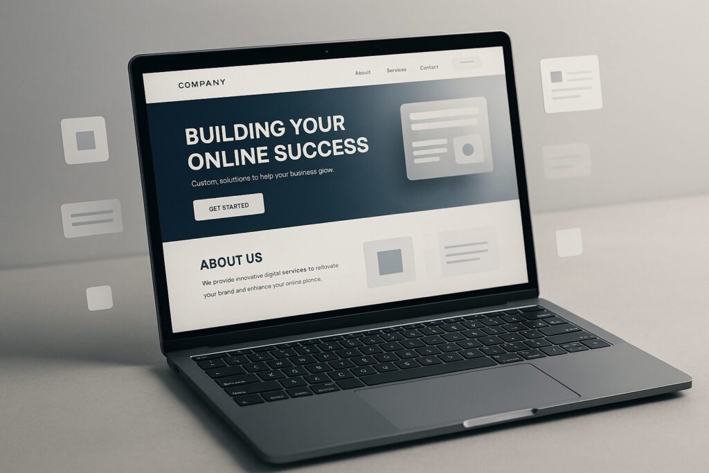
First impressions online happen fast. In just a few seconds, visitors subconsciously judge whether your site feels trustworthy, relevant and easy to navigate.
That’s why your homepage needs to communicate exactly who you are and what you offer, fast.
3 tips to achieve instant impact:
- Use clean, modern layouts that guide users effortlessly.
- Prioritise strong, concise value statements above the fold.
- Keep your visual identity consistent and professional across every page.
Polished, intuitive design shouldn’t just look good. It needs to build immediate confidence and encourage visitors to explore further.

Speed Is Everything
Nothing kills conversions faster than a slow website. According to Google’s research, 53% of mobile visitors abandon a page that takes longer than three seconds to load. If your pages are slow, users don’t wait around, they move straight to the next result in Google.
Google also factors page speed into search rankings. A slow site doesn’t just lose visitors, it becomes harder to find in the first place.
4 tips to boost website load speed:
- Compress and optimise all images and media.
- Use browser caching and lazy loading.
- Remove unnecessary scripts, plugins and bloated code.
- Choose a fast, reliable hosting provider.
Tools like Google PageSpeed Insights and GTmetrix can help you identify performance issues, so your site loads instantly and meets the 3-Second Rule!
Mobile-Friendly or Bust
Most online browsing now happens on mobile.
Your site needs to offer a seamless experience on any screen size, with a responsive layout that adapts perfectly across desktop, tablet and smartphone.
A mobile-first approach improves:
- Overall user experience (UX Design).
- Search engine rankings.
- Engagement and conversion rates.
If your site isn’t mobile-friendly, both Google and your visitors will move on without a second thought!
Clear, Compelling Communication
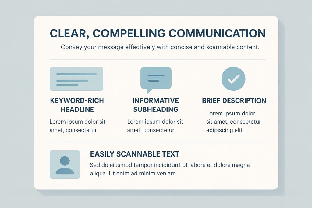
Your website’s message needs to land instantly. Visitors should understand what you offer without scrolling or overthinking it.
4 tips for clear communication:
- Write strong, keyword-rich headlines that state your purpose.
- Use sub-headings that guide the reader’s eye.
- Keep paragraphs short and content scannable, since most people skim rather than read.
- Avoid jargon, fluff and information overload.
In short: simplify. Users reward clarity and speed with trust, and they spend more time on sites that give it to them.
Strategic, Conversion-Driven CTAs
A well-designed website leads visitors toward a natural next step. That’s where your call-to-action (CTA) becomes a powerful conversion tool.
Whether you want visitors to book a consultation, explore your services or subscribe to updates, your CTA should be:
- Bold and visually distinct, so it stands out and invites a click (Stand out and entice the user to click the button for more).
- Action-driven, using phrases like “Start Your Project” or “Reserve Your Meeting.”
- Placed at strategic points throughout your site
A strong CTA removes hesitation and makes converting effortless.
Visual Flow & Readability
A smooth content flow keeps visitors engaged and reduces bounce rate.
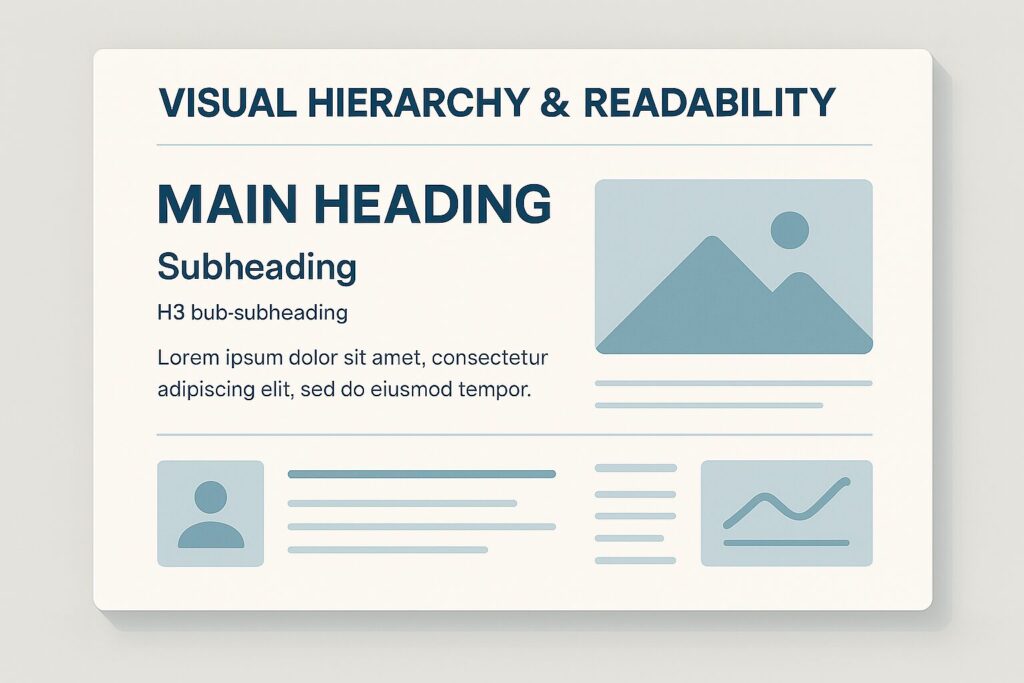
Structured design creates a clear content hierarchy, showing users what matters most.
4 tips to enhance readability:
- Use consistent headline tiers (H1, H2, H3).
- Break content into digestible sections with shorter paragraphs.
- Pair text with high-quality, relevant visuals.
- Ensure strong contrast and legible typography.
Good design isn’t only aesthetic, it’s functional.
Visual hierarchy helps visitors find what they need quickly, and keeps them on your site longer.
Optimise for Search: Be Found Fast
Even the best website fails if nobody sees it.
5 tips to improve search rankings:
- Use targeted, relevant keywords throughout your content.
- Optimise meta titles, descriptions and image alt text.
- Structure your URLs cleanly.
- Build fast-loading, mobile-first pages.
- Create authentic, valuable content that matches search intent.
Strong SEO makes sure potential customers find you at the exact moment they’re ready to engage or buy.
Own Those First Three Seconds
Your website has less than three seconds to convince a visitor it’s worth staying. The brands that master the 3-Second Rule are the ones that win online.
By focusing on instant visual impact, fast load speeds, mobile optimisation, clear messaging, strategic CTAs, strong visual hierarchy and solid SEO, your site won’t just attract visitors, it will convert them.
At KNOWN, we build websites that capture attention, build trust and drive results.
Ready to elevate your online presence?
Let’s create something unforgettable together.
FAQs
How long do visitors take to decide whether to stay on a website?
Most visitors decide within three seconds of a page loading whether to stay, scroll and convert, or leave. This is often called the “3-second rule” in web design.
Why do slow websites lose visitors?
Google research found that 53% of mobile visitors abandon a webpage that takes longer than three seconds to load. Slow load times also hurt search rankings, since Google factors page speed into how it ranks websites.
What makes a website mobile-friendly?
A mobile-friendly website automatically adjusts its layout, text size and navigation to fit any screen size, desktop, tablet or smartphone, without losing functionality or requiring users to zoom or scroll sideways.
What should a homepage communicate in the first few seconds?
A homepage should clearly communicate three things instantly: what the business does, who it serves, and what the visitor should do next. Clear, jargon-free headlines and value statements above the fold help achieve this.
How does website design affect SEO?
Website design affects SEO through page speed, mobile responsiveness, and content structure. Search engines favour fast-loading, mobile-optimised sites with clear headings and scannable content, which also improves user experience.
What is a strong call-to-action (CTA)?
A strong CTA is bold, action-driven and placed at strategic points on a page, for example “Book a Consultation” rather than a generic “Click Here.” Clear CTAs reduce hesitation and guide visitors toward converting.